

Build your own Power BI
Your Power BI dashboard looks good, but are the numbers accurate? Pitfalls of building your own and how to avoid them.
Poorly built Power BI is just Excel with a little makeup. Is yours the same?
We regularly encounter finance teams building their own Power BI reporting. The first dashboard is up and running quickly, looks good, and everyone is happy. For a while.
Power BI is a powerful tool. But looking good and functioning reliably are two different things. A poorly built Power BI has the same weaknesses as an Excel file that has grown organically over years. It just looks better.
Here you can read about the typical pitfalls of DIY projects and how to do it better.
Where self-built Power BI reports typically run into problems
These are problems we encounter time and again when analyzing the setup of dissatisfied finance teams. Do they sound familiar?
Power BI inherits the weaknesses of your Excel file.
Many custom-built Power BI reports are based on an Excel file. Power BI reads the file and turns it into a sleek dashboard.
The problem? Precisely the Excel file on which everything is based:
● Formulas that do not take new data into account because no one has adjusted the range.
● Multiple versions of the file, and Power BI might be reading the wrong one.
● Values that someone has manually overwritten instead of adjusting the formula
Power BI displays these figures, but it cannot verify them. If something is wrong in the Excel file, it will also be wrong in the dashboard. It's just less noticeable because a clean chart appears more trustworthy than an oversized Excel spreadsheet.
This means: A dashboard is only as good as the underlying infrastructure. If the foundation isn't solid, then your beautiful Power BI report won't be accurate either.
Manual work will not decrease with Power BI.
Many people associate Power BI with the expectation that reporting will be less work. If only it were that simple.
Because the data first needs to be entered into the tool. Many medium-sized businesses and their tax advisors use DATEV for their accounting. However, there's no built-in connection for DATEV in Power BI. A true interface requires additional software or a service provider.
Therefore, in DIY projects, it usually goes through export. It looks like this:
● Someone extracts the data from DATEV and saves it as an export file.
● The export file is cleaned up; for example, subtotals are deleted. Power BI could do this automatically if it were properly configured. In custom setups, it's often done manually. Errors are inevitable.
● If the export file is incorrectly named or located in the wrong folder, the new numbers will not arrive.
● If the dashboard doesn't update automatically because there's no connection to the company server, someone has to trigger it manually. If this is forgotten, management will be looking at outdated figures and won't even notice.
Go ahead and do the math: How many hours does your team spend on reporting each month? And how many of those hours has Power BI actually saved?
The dashboard and the business analysis show different figures.
A recurring problem with self-built Power BI reporting is that the revenue shown in the dashboard differs from the profit and loss statement.
Often, the underlying issue is account allocation, specifically which account corresponds to which item in the report. A typical example is discounts and bonuses: the standard business analysis (BWA) deducts them from revenue. If the custom system assigns these accounts to a different account, the revenue displayed on the dashboard will be too high.
For a single company, this is still manageable. With several, it becomes a complex matter, especially if they use different charts of accounts. Sales revenue is recorded in account 8400 in SKR03 and in account 4400 in SKR04. And in SKR03, account 4400 is an expense account. Anyone combining multiple companies must also exclude transactions between them; otherwise, the same revenue will be counted twice.
Sometimes it's not a matter of logic, but of timing: The dashboard shows the export from the beginning of the month, while the BWA already includes the corrections that the tax advisor subsequently booked.
Regardless of the reason, a report that no one trusts because it spits out contradictory figures is bad reporting. Period.
Need a quick new analysis? Probably not.
When building your own system, the data usually enters Power BI as it comes from the accounting department: as a long list of all transactions, in a single large table. Charts can then be built directly from this.
What's regularly overlooked, however, is an intermediate step that will come back to haunt you later: sensibly dividing the data beforehand. Put bookings in one table, accounts in another, companies in another, months in another, and then link these tables together.
This becomes a problem as soon as new requirements arise. You want to compare the plan to the current situation, a new company is added, you want to see the contribution margin per customer. In a well-structured model, you would create a new table for this and link it to what's already there. But in the existing large table, there's nothing to which it can connect. So, you have to restructure: expand the table, adjust formulas, check if the old analyses are still accurate. And you have to do this for every new requirement.
Finally, you send PDFs and screenshots.
A report rarely has only one reader. Management wants to see the big picture, the site manager their site, the division manager their department.
Ensuring everyone gets exactly what they want requires a fair amount of work in Power BI:
● For each group of readers, you create a separate rule, for example, "only sees location North". This requires that the data model is cleanly structured; otherwise, there's nothing for the rule to apply.
● Every rule must be tested. Does the site manager really only see their own numbers, in every total and every chart?
Completely hiding salaries is even more complex and cannot be set up in Power BI itself. An additional tool is required for this.
● Anyone who wants to view the report in their browser usually needs their own paid license.
● And the maintenance never stops: new employees, department changes, a new location. Every change has to be implemented.
Building your own dashboard often requires a lot of time or expertise. The result: either everyone sees everything, including numbers they aren't meant for, or you end up taking screenshots and creating PDFs every month and emailing them, customized for each recipient. And in the end, your beautiful dashboard is only accessible to one person: you.
What the DIY brand will cost you
Quite simply: time. Lots of it. It's spent troubleshooting when the figures don't match the business analysis, in every redesign for a new report, in every update that fails, and in maintaining user permissions. Then there's the time the person responsible for reporting loses. They should really be analyzing the data, not keeping the dashboard running.
If the model needs to be redesigned at some point, for example by an external consultant, you end up investing twice: once in the self-built model and once in the new building.
One hour instead of overtime: your benefits with loyos
loyos offers you everything that Power BI does well, plus the foundation that is missing when building it yourself.
The clear and concise dashboards remain. Beneath them lies what makes them reliable: interfaces to DATEV, SAP, Sage, or Lucanet instead of manual exports, and a clean separation of original data and data cleansing. Multiple companies are automatically merged, and planned values run directly alongside actual figures.
Over 25 standard reports are available from day one, from the profit and loss statement to the balance sheet. If you need your own key performance indicators, dashboards, or interfaces, we'll develop them for you.
A typical setup takes less than two weeks, with your own effort averaging about an hour. After that, you're not on your own: you have a personal expert from the Finance -area, we will further develop your reports with you, and if you wish, we will also support you in interpreting the figures.
In a free initial consultation, we'll review your current reporting structure and demonstrate loyos using an example. Afterwards, you'll know whether switching to loyos is worthwhile for you, or whether your current system is sufficient.
Discover more insights
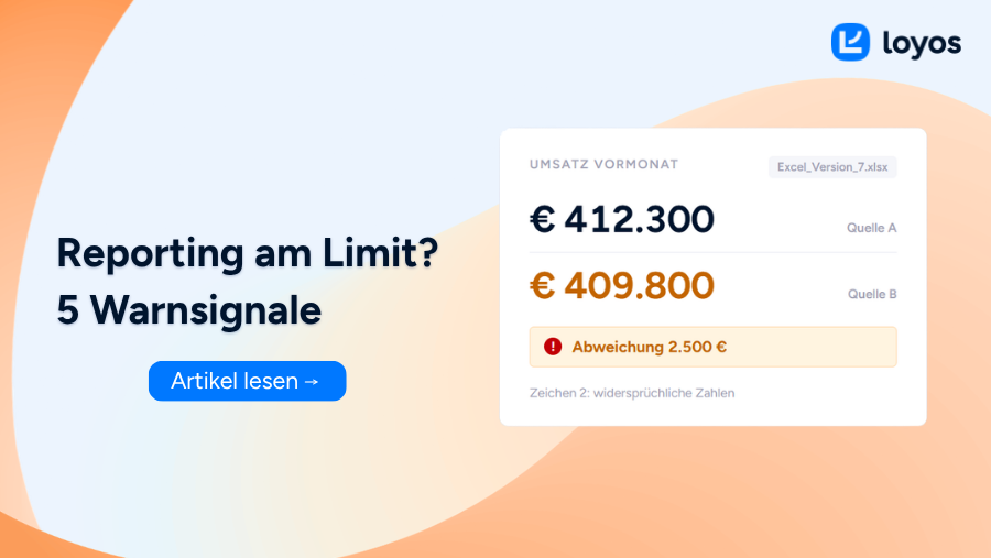
5 signs that your reporting setup is reaching its limits
5 signs that you've outgrown your reporting setup and what you can do about it.
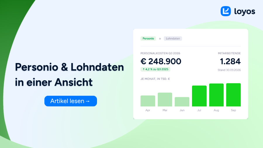
Analyze Personio and payroll data in one view
Personio master data, DATEV/SAP salaries: one view instead of separate evaluation.

These reporting basics will help you increase your selling price.
Selling a company? How good reporting influences the purchase price.